Making Home | Cooper Hewitt

Contrast Form Gestalt - CFGNY (Concept Foreign Garments New York)
 When finalizing plans for their new home in 1902, the Carnegie family engaged interior designer and landscape painter Lockwood de Forest to create a unique space for their private library.De Forest conceived a total environment produced by the Ahmedabad Wood Carving Company in India, a venture he established with trading heir Maganbhai Hutheesing in 1881 to promote and commodify the aesthetics of Indian craft. The resulting room copies and collages details from Ahmedabad tombs, mosques, mausoleums, and domestic architecture, now placed in an elite US context. In response, multidisciplinary collective CFGNY interrogates the practice of anonymizingAsian design through the decorative arts economy. InContrast Form Gestalt, the mansion’s library is recontextualized with contemporary construction materials, revealing through careful cutouts carved teak details and collaboratively painted landscapes that splice together elements of paintings that de Forest made on his travels around the world. At the center is a group of un-attributed objects from Cooper Hewitt’s permanent collection, each originating from a region that informed de Forest’s work. By arranging them in the shape of a human figure, CFGNY critiques the 19th- and 20th-century collecting practices of Western museums, which systematically depersonalized makers. Together, these interventions draw attention to how appropriation can dilute cultural artistic practices and invite a closer look at the complex legacy of inherited material culture in the US. CFGNY is Tin Nguyen, Daniel Chew, Ten Izu, and Kirsten Kilponen. VISUAL DESCRIPTION Contrast Form Gestalt is installed in a dimly lit gallery. A wooden structure has been built right in front of every wall, reaching from the floor to nearly the ceiling. Semi-opaque plastic sheeting is stretched and secured around the wood framed pieces all the way around the room. There is another structure made of the same materials in the center of the room like a pillar that’s wrapped around a stained-glass hanging lamp. The ceiling’s warm brown and dusty gold elaborate floral pattern remains unobscured. There are openings built into the structure. Intricate swirling dark teak wood carvings peek through the contemporary construction materials, framed by the window-like cutouts in the structure which hold four of CFGNY’s landscape paintings. The works have surrealist qualities as they blend together multiple landscapes and architecture. Each painting is medium sized, horizontal, with a glistening varnish.   Upon entering the gallery, the wall next to the entrance on our right holds the first painting. Against a grayish blue sky, the top of the painting depicts the tops of tall green trees and a mountain in the distance to the far left. The landscape is seemingly reflected at the bottom of the painting, perhaps in a body of water which blends into two different scenes of architecture. The middle left of the painting shows the top of a red structure with a dark roof, and another roof seems to be floating like a memory. The middle right of the painting shows a different landscape with a tall tower against a warm yellow and pink sky. The center of the painting contains a vertical rectangular area, like a viewfinder or portal, that is painted with only one color, a warm orangish brown like a raw or burnt sienna. It seems like it could be either the underpainting of the green surrounding forest, or the forest on fire. Turning towards the wall on our left, we walk towards the back of the gallery finding another cutout higher up on the plastic-covered wall. This painting seems to combine multiple mountainous landscapes painted in layers. Under the clear light blue sky at the top of the painting, is a landscape with pyramids in the distance. Underneath the brown soil is another landscape of whiter colored terrain above a strip of blue that could be either a river or the sky. More mountains below the blue are pinkish with white caps, perhaps of snow. The bottom of the painting shows a vast landscape of pinkish brown and drier soil, with clumps of grass speckled across the terrain.    Turning to the left side of the back wall of the gallery, the third painting is hung low in a cutout in front of a shuttered window. In the center of the painting is a small bright moon that illuminates the cloudy night sky. Like a supernatural mist, the sky overlaps large elaborate architecture painted in glowing shades of orange brown. Doorways lead to what appears like a brownish body of water at the bottom of the painting. Turning from the back wall on our left, making our way around the room and central pillar, the final painting is hung high and is somewhat obscured. The painting leans on what seems to be the wood mantle of a covered fireplace, and the cutout reveals two vertical and intricately carved wood beams that make us move around in order to look closely at the painting. An underpainting of fiery orange brown raw sienna wraps around the scene and blends into the mountains in the distance and blue ocean waves mysteriously leads to rocks and an open doorway.  There is a cutout on two of the four sides of the plastic covered three and half foot wide central pillar, creating rectangular windows. The rectangular windows are roughly eye level when standing facing the entrance and the back of the room. The pillar glows from the warmth of the veiled lamp above. Displayed inside the pillar are fourteen unattributed antique objects arranged like a human body seated on a white platform with their legs stretched out in front of them. The figure, collaged from the precious objects,faces the gallery entrance from behind glass. They wear a beaded necklace as a crown or halo with small white beads and precious embellished stones. The head is a round sword guard with a slit in the middle. A shard of patterned ceramic floats between the head and necklace. The body is a shiny silver prayer holder which is square shaped with intricately carved designs. A cosmetic flask and white brise fan make up the arms. A thin opium pipe, a long votive box for a mummified eel with flecks of green, and a long dark printing block make up the legs. A brass color manicure set in the shape of a small hand and small round snuff bottle make up the hands, while another small, rounded snuff bottle and a pointed claw-like embellishment on the votive box make up the feet. Small round golden earrings appear to be shoulders, and a small printing block, carved with writing or symbols, is positioned as a pelvis.

Scroll

Back in the early 2000s, while NYC’s design scene was early in development, Cooper Hewitt’s Design Triennials were introducing global design trends to the city. The early iterations offered a snapshot of the latest in product design, fashion, identity and graphics and mobility. It was a time when design blogs weren’t as numerous and thorough with coverage. So every three years upon checking out the triennial, you might see some surprises.

Over the years, the triennial has morphed from broad survey to a specific themed exhibition. The 2019/20 edition focused on contemporary design’s relationship to nature. For the 2024/25 season, the museum has staged Making Home, an exploration of design’s role in shaping the physical and emotional realities of home across the United States, US territories and Tribal Nations. It’s a vast subject matter encompassing a broad spectrum of geographies, regional cultures, age groups, and financial states. Zooming in on how design could improve/solve issues of development and affordability could easily fill the museum’s galleries.

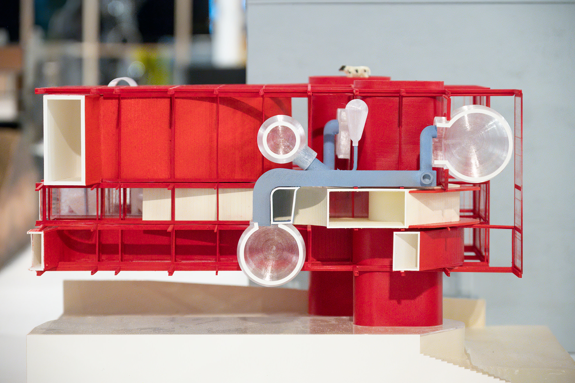
What the exhibition presents are 25 installations relating to a laundry list of social issues. Most of these were created by artists and rather than present an idea or solution to a problem, They serve as visual set pieces that support a narrative or condition. While all of topics including racial, health and basic human compassion issues are no doubt important, the exhibition tries to bind too much together thus reducing importance. Any one of these could have been selected for greater focus and potentially stronger impact.

Making Home also suffers from a poorly executed exhibition design. Reading about each of the installations is necessary to understand and appreciate the work. However, each work is backed by multiple paragraphs of tiny text printed on floor standing placards, many in quite dark rooms. There’s an alternate QR code/read on phone option but a better placed printed summary would have improved the experience.

There were a couple of notable design-focused projects. The Architecture of Re-Entry by Designing Justice + Designing Spaces proposes pre-fab private living quarters to improve the halfway house experience for released convicts.

Architecture firm Hord Coplan Macht included senior friendly furniture in a mock-up interior installation Aging and The Meaning of Home. I’m guessing there’s an untapped opportunity for more stylish furniture for the elderly and those with physical mobility issues.

I think Making Home as a distinct exhibition would have made more sense than billing it as a triennial edition. It feels 3/4 Whitney-museum biennial inspired art experience leaving 1/4 of the work relating closer to actual design problem solving. I’m hoping in three years time, the next show will address a more focused topic like AI or breaking out of The Age of Average.

Photos and Text: Dave Pinter

Photo Captions: Cooper Hewitt